Start Date: April 1
End Date: April 3
Blog Post
The projects I have in mind for this month will fall broadly into one of two categories. In the first category, I’ll aim to test my front-end design skills with little more than HTML and CSS - aside from build processes, there will be little JavaScript involved in the final products. In the second category, I’m going to focus on building out working applications with different JavaScript frameworks. Aesthetics still count here, but the challenge is meant to come mostly from my self-imposed deadlines.
I decided to start off this month with a project from the second category. And I thought I was starting off simple. I decided to use a framework I’ve known of for a while, but have never gotten around to actually using - Vue.js. I know a few people who swear by this framework, and after a few days with it, it’s easy to see why. A few tutorials and the Vue CLI made it so easy to start working with that it felt like cheating, and installing Vuex when I realized I needed it took all of two minutes. By the time I finished with the project, I was already looking forward to building something else with it.
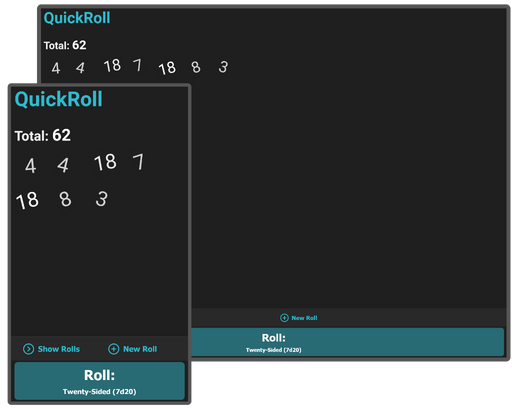
That was the good news. While I had a lot of fun working with Vue, I ran into a few DOM-related roadblocks while trying to make the application display well everywhere. As you can see from the thumbnail, I had the idea in my head that I was going to make a full-height web application, a mobile-first display with most of the controls on the bottom of the screen where they would be easy to use. Furthermore, there is a sliding-drawer effect to switch between views - pressing ‘Show Rolls’ causes the roll-editor section to slide up and cover most of the screen.
In other words, I chose a layout which gave mobile browsers every conceivable chance to bug out. And they did. The biggest issue was always with the slide-out keyboard on my Android device - it tends to push the layout up and out of the view when it extends, and the layout tends to stay pushed up even when it retracts, leaving the header hidden from view. I was able to alleviate this problem a little by switching from absolute positioning to grid-based, but it still crops up from time to time. Ultimately I ran out of time, and the project ended with mobile usability not quite being what I’d hoped.
This wasn’t the worst start to the month - and I’m happy with the tools I used. But I might go with some more standard layout decisions going forward.
Remarks
Now that I'm a month on from this project, it's clear I had a lot more energy at the start of the month than I did near the end. Of the two or three "functional" projects I created, the "QuickRoll" app is easily the most detailed and useful, and would make a good-enough MVP if the UI was improved a little.
It's telling that I considered this project a "warm-up". I didn't fully appreciate it at the time, but the crux of this challenge (create applications with unfamiliar tools) is hard to pull off on a deadline. Additionally, this app had an unfair advantage simply by coming first - I had a good idea of what to make several days before April started. As a result, the (relative) quality of QuickRoll wasn't indicative of what I'd produce over the rest of April. And it wasn't until the next couple of projects that I learned to check my expectations a bit.